Building a shared design language that brought brand, product, and engineering together across Playo's growing sports ecosystem.
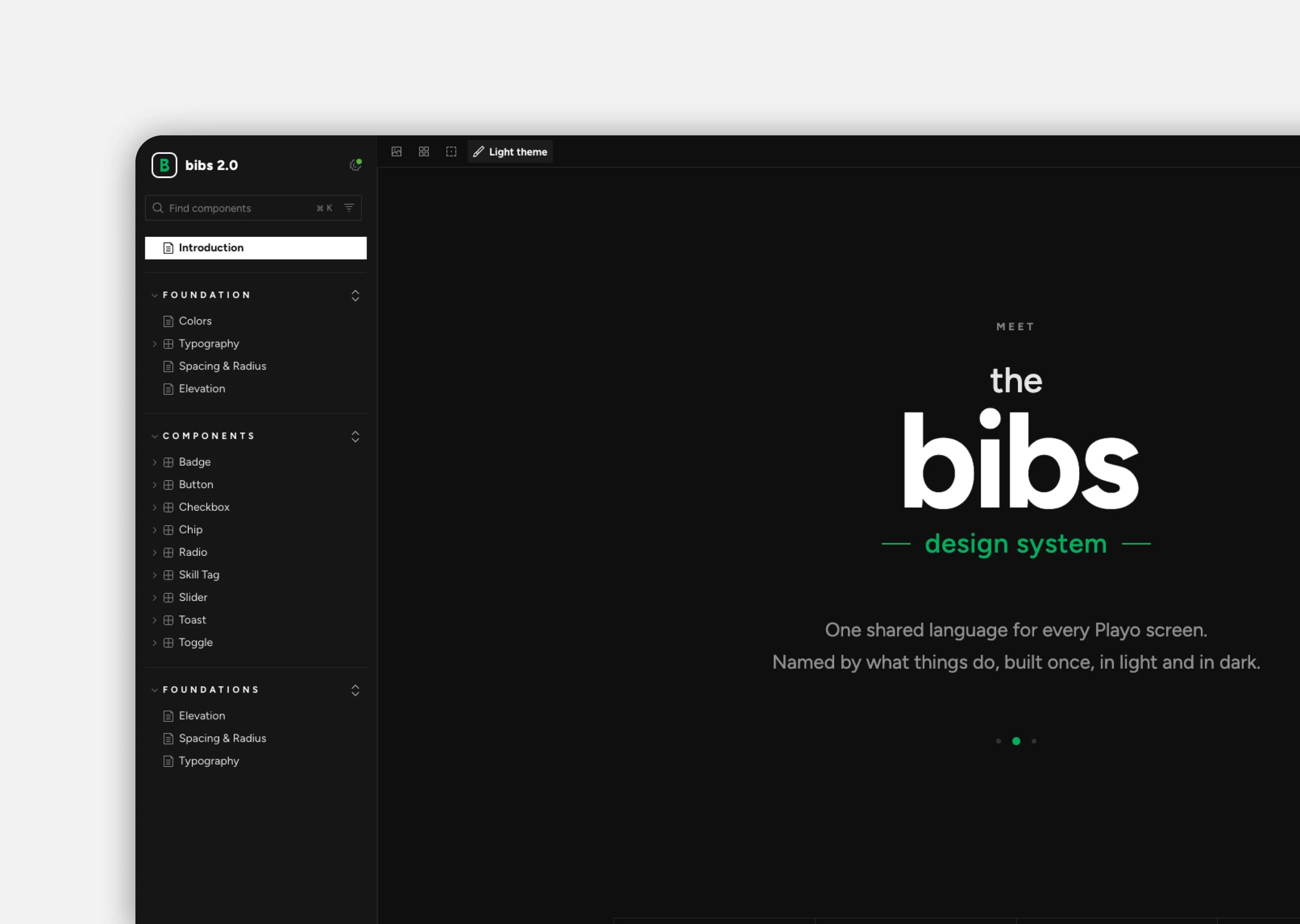
Bibs is that language: semantic tokens with a light and a dark value, one typeface with 23 styles, 120+ sport icons and a component library built from atoms up, documented in Storybook for every team.
Senior Product Designer
Role
iOS, Android, Web
Platforms
6 Months
Timeline
01 / The Challenge
A growing product. A fragmented experience.
As Playo expanded across platforms, inconsistencies started appearing in the way interfaces were designed and built. Similar components had different styles, behaviours, and implementations, making it harder to maintain a cohesive experience.
With multiple teams contributing to the product, we needed more than a collection of reusable components. We needed a shared foundation that could bring everyone together.
The opportunity
How could we make Playo feel like one product while giving teams the flexibility to build and scale?
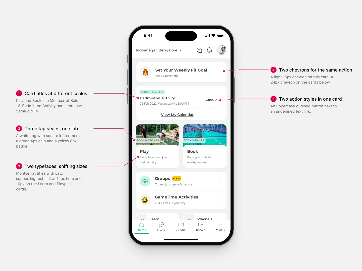
The Home screen before Bibs: five inconsistencies on a single screen
02 / Discovery
Finding the gaps before connecting the dots.
I started by auditing Playo's iOS, Android and web experiences, identifying inconsistencies in typography, colours, components and interaction patterns.
I also ran sessions with marketing, engineering, product, operations, customer support and data to understand their challenges and how design decisions were being made. Alongside this, I analysed competitor products to find established patterns and opportunities to improve Playo's experience.
Who I worked with
Six teams touch Playo's design in very different ways. Before designing anything, I sat with each of them to understand how they work and where the old system let them down.
Marketing
Campaigns, social media and the brand's voice
What I heard
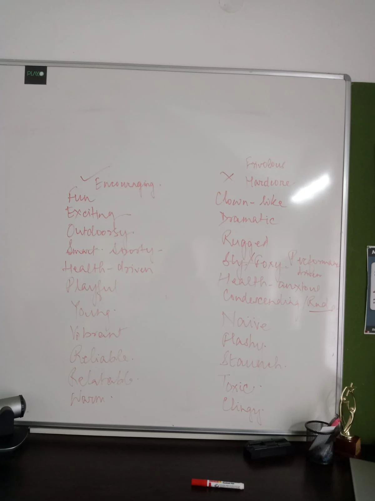
Every campaign had to find the same balance: entertaining, but never all fun. In our workshop we wrote down what Playo is and what it must never become, and agreed it sits where sport brings excitement and a sense of exploring.
How it shaped Bibs
That tone became the brief for the product's colour, type and imagery, so the app sounds and looks like the campaigns that bring people to it.
Engineering
Building and maintaining the app on iOS, Android and web
What I heard
Hardcoded values everywhere, duplicate components, and components and type styles nobody had used in years. The same colour even existed twice under two different names.
How it shaped Bibs
Tokens replaced hardcoded values, each colour got one semantic name, duplicates were merged into single components, and unused components and type styles were retired.
Operations
On the ground at venues, with players and venue managers
What I heard
Offline banners came in different colours and new fonts that didn't connect to the brand. Each venue showed a different icon for the same sport, and players sometimes mistook Playo for a competitor whose palette looked almost the same.
How it shaped Bibs
A distinct, owned palette and one typeface for every touchpoint, online and offline, and one sport icon set that venues use too, so a badminton court looks like Playo's badminton everywhere.
Product
Planning features and shipping them
What I heard
Every other team's feedback ended up on their roadmap: support's navigation complaints, the data team's evening usage, engineering's rebuild time. They needed features to ship faster across all four verticals, without each one starting from a blank screen.
How it shaped Bibs
Bibs became a kit for planning as well as building. Features are scoped around components that already exist, and fixes like clearer navigation and dark mode are shipped as system changes, not one screen at a time.
Customer Support
Hearing directly from players every day
What I heard
Players found the app confusing to navigate. Many also mistook Playo's app icon for WhatsApp's: we had drifted into a similar green gradient, and both marks pointed to chat.
How it shaped Bibs
Navigation became a system-level pattern, with one set of title bars and one tab bar behaving the same way on every screen. The icon confusion fed the brand work with marketing: Playo's colour had to feel distinctly its own, not borrowed from a messaging app.
Data
Understanding when and how people use Playo
What I heard
Most activity happens at night. The 7 to 8 PM slots are the most booked, and conversations around games follow after that, yet the app had no dark mode.
How it shaped Bibs
Dark mode became a requirement from day one: every semantic token carries a light and a dark value, so the whole product works comfortably in the evening hours people actually use it.
What I learned
The problem wasn't limited to visual inconsistencies. Teams needed clearer references, shared conventions, and a more predictable way to turn design decisions into working interfaces.
From the audit: type names that described one-off uses, mapped to one clear scale
03 / Brand Alignment
One brand. Every touchpoint.
Playo's identity lived across marketing campaigns, social media and the product itself. Translating that identity into a consistent interface needed a shared direction.
I worked with the marketing team to align brand tone, colour palette and visual language, so the product felt recognisably Playo on every platform. Those decisions became the starting point for Bibs, connecting the brand's personality with what the product needed to do.
The words we chose, and the ones we didn't
In the workshop we wrote two lists on the whiteboard: what Playo is, and what it must never become. Fun and exciting, but never frivolous or clown-like. Health-driven, but never health-anxious. That line became the brief for colour, type and imagery.
The whiteboard from the marketing workshop
Playo is
Encouraging
Fun
Exciting
Outdoorsy
Smart & sporty
Health-driven
Playful
Young
Vibrant
Reliable
Relatable
Warm
Playo is not
Frivolous
Hardcore
Clown-like
Dramatic
Rugged
Sly, foxy
Performance-driven
Health-anxious
Condescending, rude
Naive
Flashy
Staunch
Toxic
Clingy
04 / Why Atomic
Fix it once, at the smallest level.
The audit made one thing clear: Playo's inconsistencies didn't start at the screen. They started with the smallest pieces. Three tag styles did one job, two chevrons meant the same thing, and two action styles sat in the same card. Every new screen re-solved those small decisions, so every screen drifted a little further.
That's why I chose atomic design. It builds interfaces up from the smallest parts, so a decision made once at the bottom carries all the way to the top. Fix a chip and every card that uses it is fixed too. Consistency comes from the structure, not from reviewing every screen.
It also gave every team one shared vocabulary. Engineers on iOS, Android and web already compose UI from small parts, so “is this an atom or a molecule?” became a quick, common way to decide where a piece belongs, who owns it, and whether it already exists. And because Playo-specific patterns like activity cards are assembled from shared atoms rather than drawn as one-offs, new features stay on-system by default.
From tokens to pages
TokensColour, type, spacing, radius
AtomsButtons, icons, checkboxes, badges
MoleculesChips, toasts, skill tags, filter tabs
OrganismsActivity cards, filter sheet, header
TemplatesTitle bars and screen layouts
PagesHome, Pay & Join, Playo PRO
05 / Foundations
Tokens: the layer beneath the atoms.
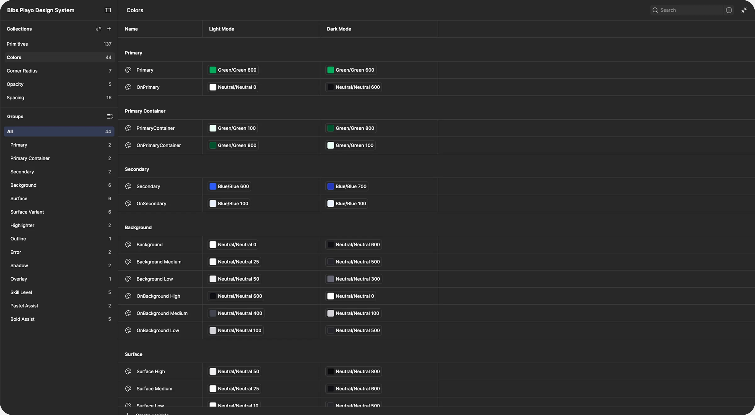
Before any component, I built a token architecture with Figma variables. Foundational values sit in reusable primitives, and semantic roles give each one a job.
Every semantic colour carries a light and a dark value. The data team's numbers made that non-negotiable: Playo is busiest at night, with 7 to 8 PM the most-booked hour. Everything built on top shares one visual foundation, in both themes.
How a value travels
PrimitivesCore valuesGreen 600
SemanticsMeaningful rolesPrimary
ComponentsReusable UIButton
The variable collections in Figma: each semantic colour mapped to a primitive, in light and dark
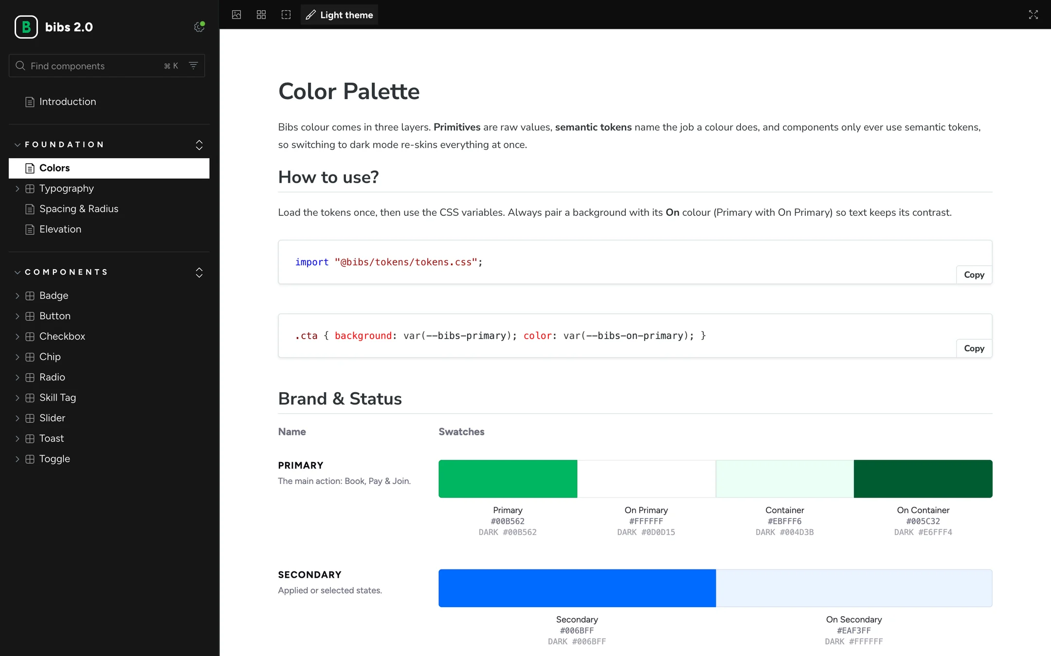
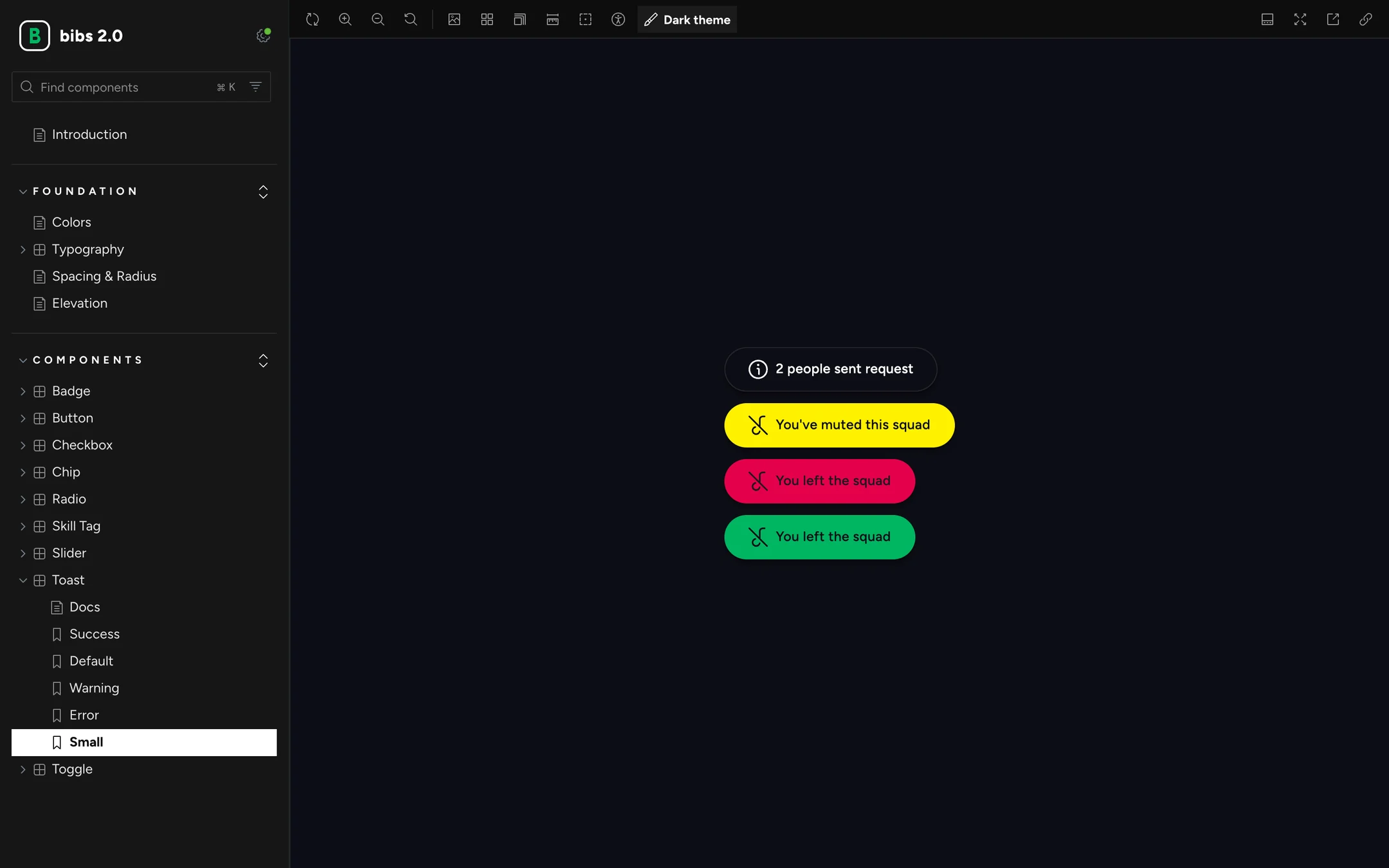
The same tokens, documented in Storybook
06 / Atoms
The smallest pieces, decided once.
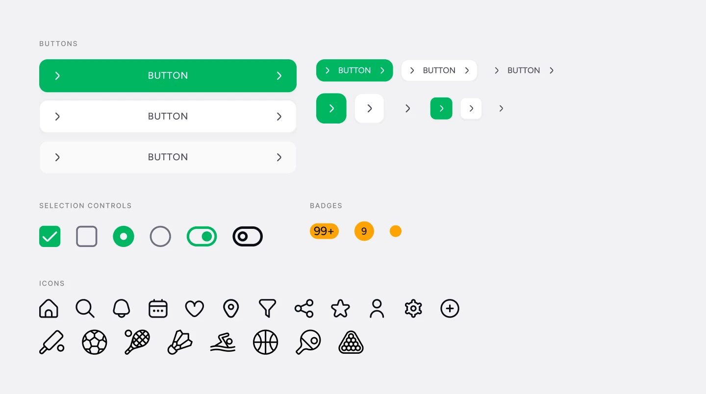
Atoms are the parts that can't be broken down further without losing their meaning: type styles, icons, buttons, checkboxes, radios, toggles and badges. Each is built only from tokens, with every size and state defined.
Atoms in Figma: buttons, selection controls, badges and icons
Typography
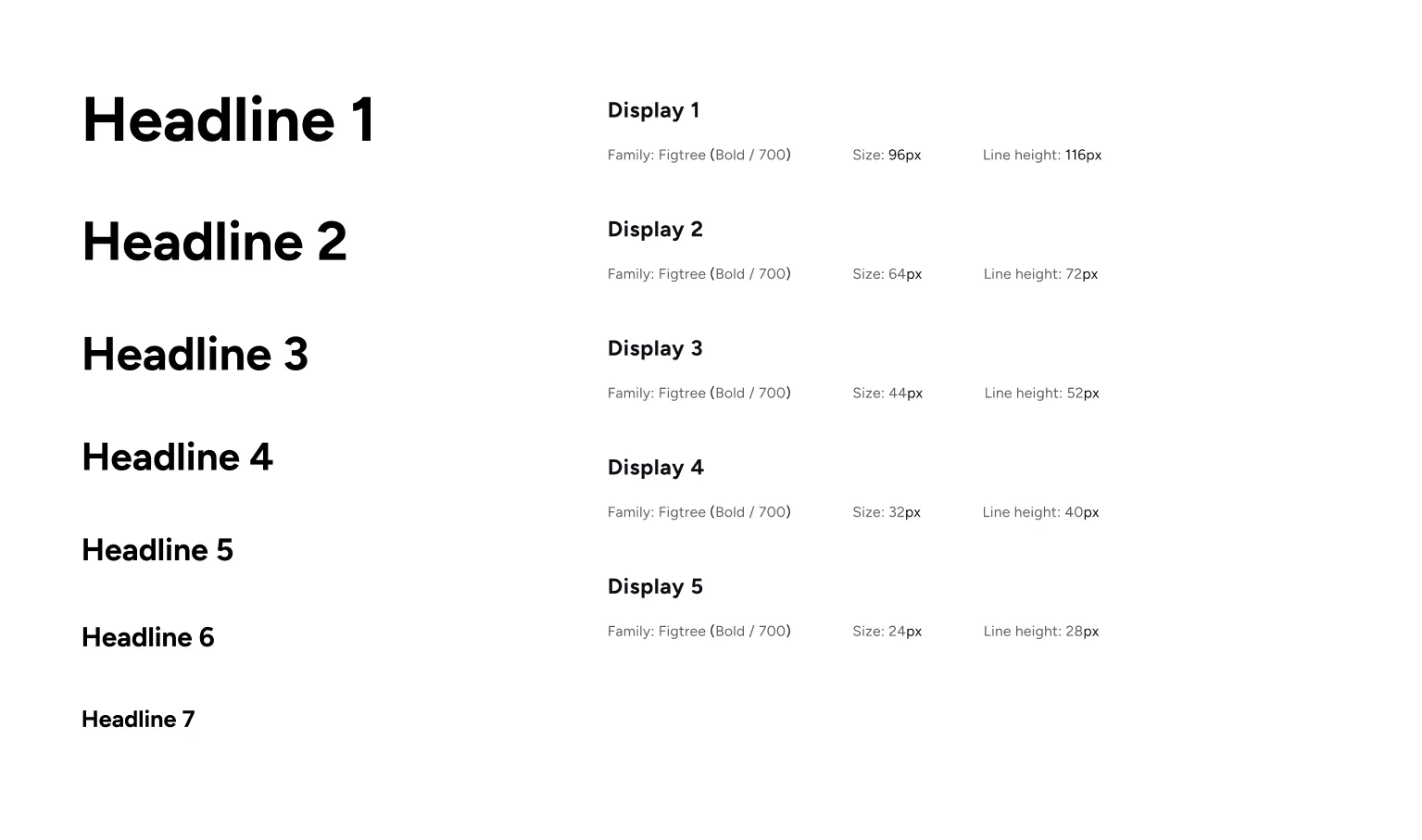
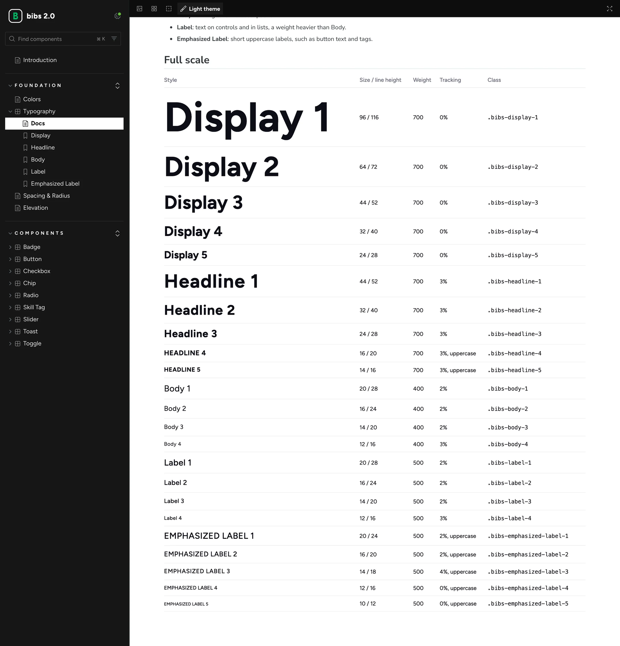
Figtree, for its clean, approachable character and a match for Playo's energy. 23 styles across display, headings, body and labels, defined for iOS, Android and web.
Aa Bb Cc
Play more. Together.
Discover games, find players, and make every day a play day.
Figtree · Display 96/116 · Headline 24/28 · Body 16/24
The full scale in Storybook: all 23 styles, from Display 1 to Emphasized Label 5
Iconography
One consistent Flaticon family for interface actions. For sport, existing libraries fell short: Playo covers 120+ sports, so I designed a custom icon for each one.
120+
Sports, each with its own icon
Built for the sports ecosystem
A few of the 120+ sport icons
07 / Molecules
Simple combinations with one job each.
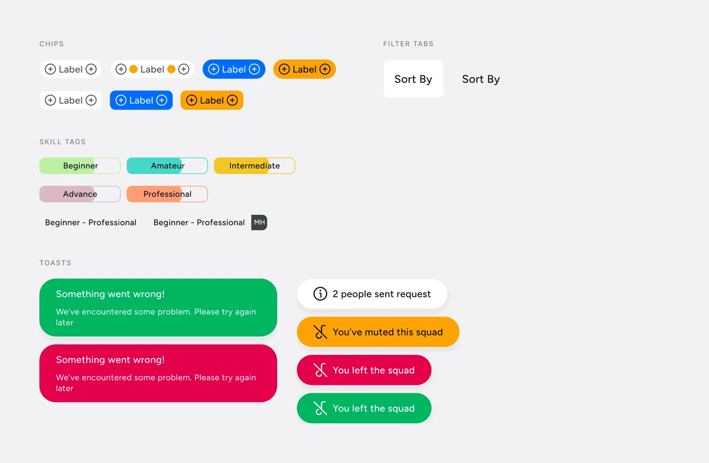
Molecules pair atoms into small, reusable units: an icon and a label become a chip, an icon and a message become a toast, a level colour and a label become a skill tag.
This is where the audit's duplicates disappeared. Instead of three tag styles doing one job, there is one chip with clear variants for default, selected and highlighted states.
Molecules in Figma: chips, filter tabs, skill tags and toasts
Toasts: one icon atom, one message, four types, shown here in dark mode
08 / Organisms
Playo's own patterns, built from shared parts.
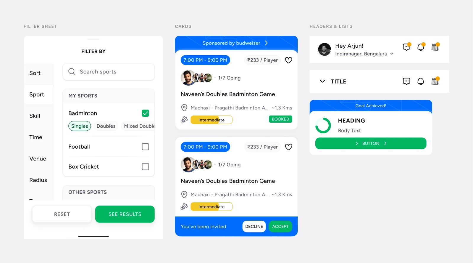
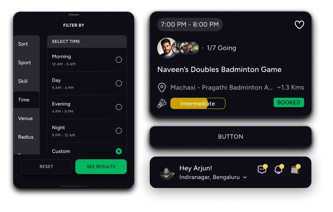
Organisms are the distinct sections of a screen: activity cards, the filter sheet, calendar cards, list cards and the header. These are where Playo's product lives, and they're assembled entirely from molecules and atoms.
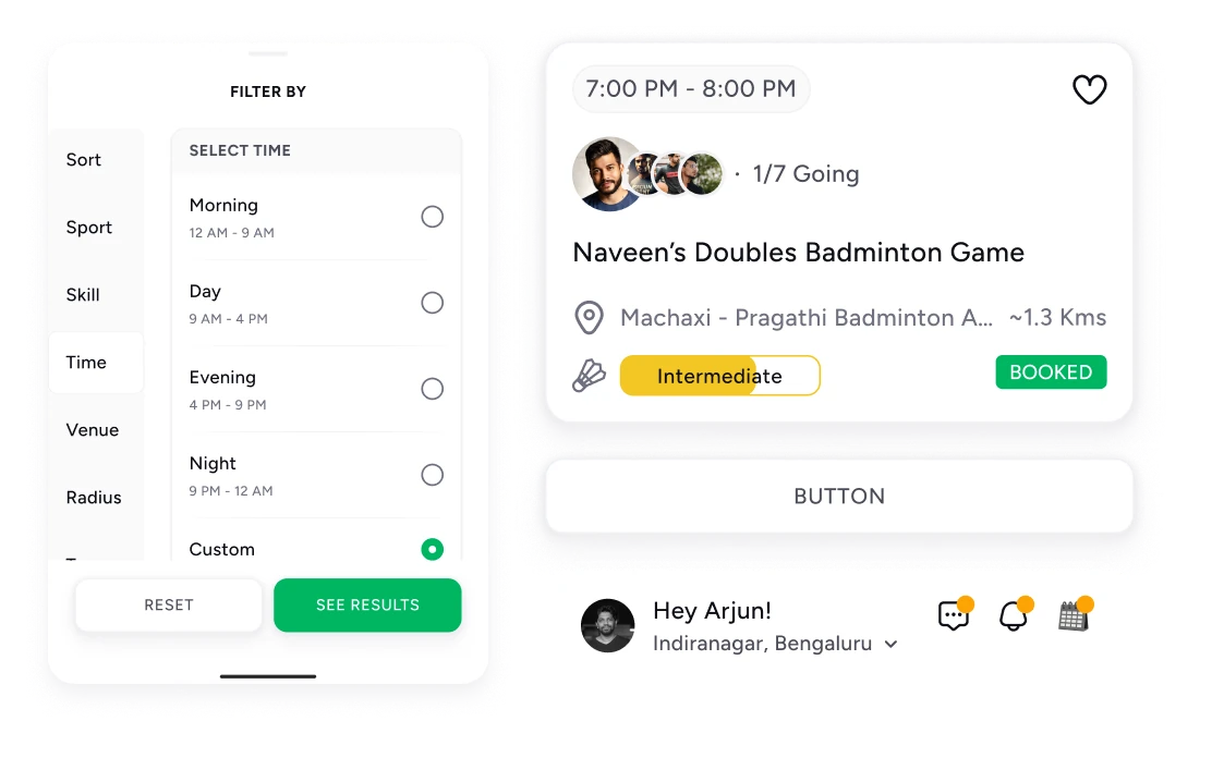
Because they share the same tokens underneath, an organism switches theme as one piece. Drag them across below.
Organisms in Figma: the filter sheet, activity cards, headers and list cards
Light
Dark
The filter sheet, an activity card, a button and the header: one set of organisms, two modes. Drag to switch.
09 / Templates & Pages
From structure to real screens.
Templates set the structure of a screen without its content: title bars for home, collapsed, image and action headers, with regions for the organisms below.
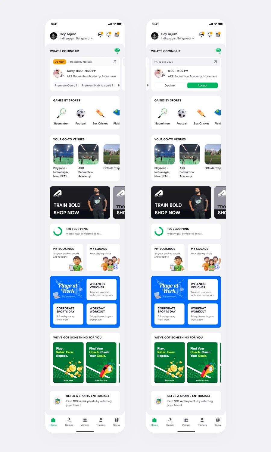
Pages are those templates filled with real content. The redesigned Home, Pay & Join, Playo PRO and the dark-mode screens were all built this way, which is where the system proved itself on real work.
From atoms to experiences
Every card, chip and button on the screens below comes from Bibs. A new page is a new arrangement of existing parts, not a new set of decisions.
The redesigned Home, assembled entirely from Bibs organisms
10 / Documentation
Designed in Figma. Understood by everyone.
A component library alone wasn't enough. Designers and developers needed a common reference for how components should look, behave and be built.
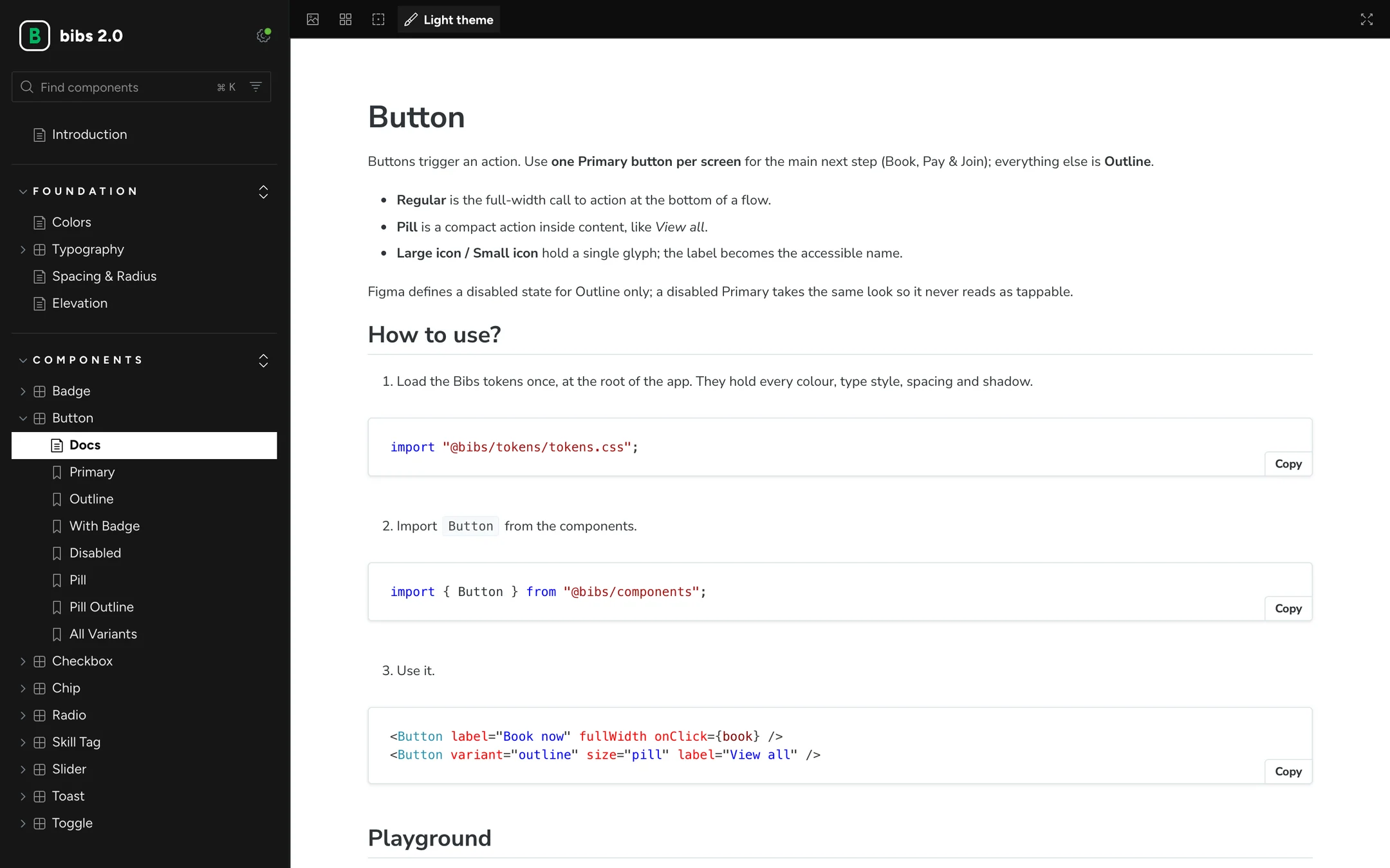
I documented Bibs in Storybook and GitHub, organised the same way as the system: foundations first, then components from atoms up. Every page explains when to use a component, then shows how, with copyable snippets and a live playground.
One reference. Shared across teams.
Designers, engineers and product work from the same pages, so a question about a component has one answer instead of three.
How to use: load the tokens, import the component, use it
11 / AI Integration
From Figma to a working staging app, with Claude.
As AI-assisted development became part of how we prototype, I explored how Bibs could be used by AI tools, not just by people.
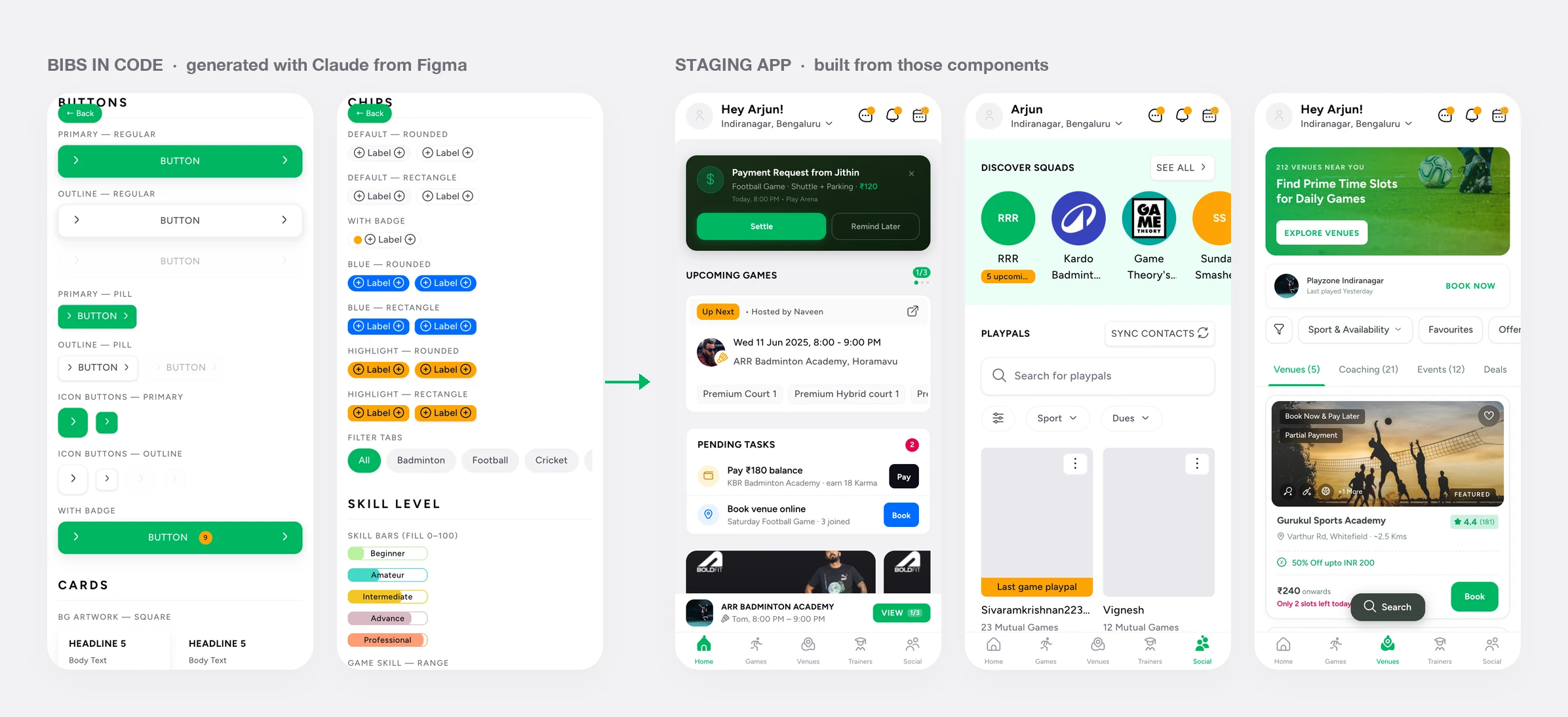
In a Claude project, Joinee Profile, I connected Claude to the Bibs Figma file. It rebuilt the system in code: the tokens as one file, and 31 React components, 25 of them traced back to their exact Figma nodes, with a written guide to every one.
From those parts, Claude assembled a staging app with 14 screens and flows, including Home, Play, Pay & Join, Booking and Split Payments, so ideas could be tried end to end on a real build. A design-audit skill closes the loop: after each screen, Claude compares the build with its Figma frame and checks every value against the tokens.
Design knowledge, made more accessible.
Because Bibs is structured as named tokens and atomic parts, Claude could read it the way an engineer does, and build with it instead of guessing.
joinee-profile Claude project
design-system/tokens.tsColour, spacing, radius and shadow tokens as code
design-system/components/31 components, 25 traced to their Figma nodes
playo-design-system.mdA 664-line guide to every component
skills/design-auditChecks each built screen against Figma and the tokens
14 screens & flowsHome, Play, Pay & Join, Booking, Split Payments, Squads and more
Bibs in code on the left, the staging app built from it on the right
12 / Impact
Less repetition. More room to build.
Bibs gave Playo's products a shared foundation, so design and engineering worked from consistent patterns and common references.
Teams stopped recreating familiar components, alignment between them improved, and the experience became more consistent across platforms.
120+
Sport icons, one per sport
03
Platforms supported
One
Shared design language
Where Bibs shows up
The brand doesn't stop at the app. Every place someone meets Playo now draws on the same colours, type and voice, so a booking email, a WhatsApp reminder and a banner at the courts all feel like one product.
01
App
Booking, games and payments, in light and dark mode
02
Website
The same tokens and type, carried onto the web
03
Emails
Booking confirmations and campaigns in one visual voice
04
Push & WhatsApp
Short messages that keep the same tone of voice
05
Social & app stores
Posts and store screenshots built from real Bibs screens
06
Partner tools
What venue owners use to manage their bookings
07
Venue signage
Billboards and banners at partner venues
08
Events & merch
Tournament kits, bibs and event branding
Out at the venue
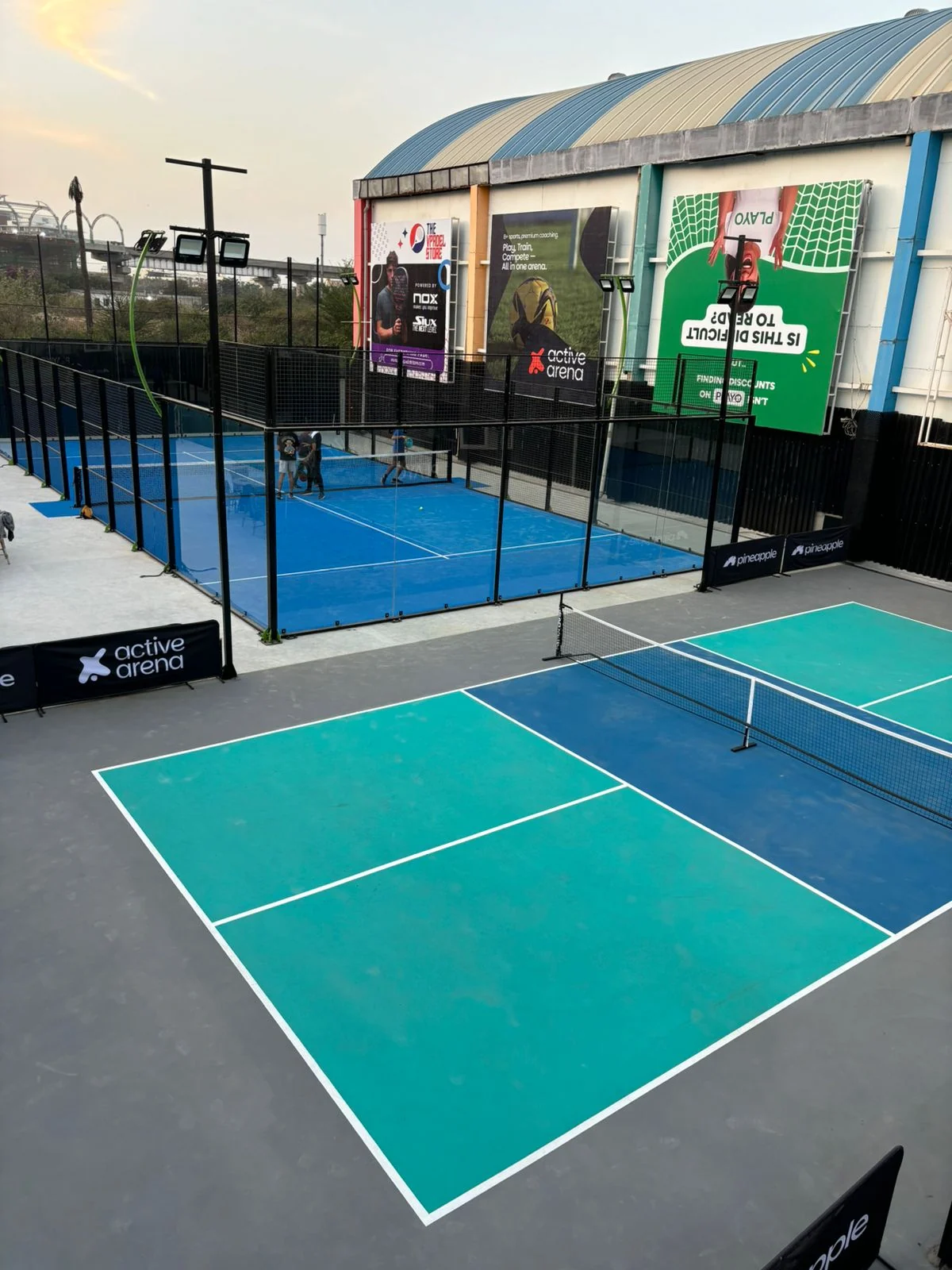
After Bibs, offline material followed the same rules as the app. This billboard at a partner venue uses the new colours, type and voice, and holds its own on a wall full of other brands, the exact problem the operations team had raised.
13 / Takeaways
The real system was how we worked together.
Building Bibs taught me that a design system is more than a library of components. It's a way to connect people, decisions and processes.
Atomic design gave that a shape everyone could follow, from aligning the brand with marketing to working through implementation with engineering. The biggest lesson was to think beyond individual screens and build foundations that help a whole team move forward.
“Good design systems don't just create consistency. They make collaboration easier.”